Category

Home Decor

Category

Important Points

  • Wood grain brings natural warmth and pattern into indoor spaces.
  • Texture that follows the grain makes laminate look and feel more natural.
  • Wall panelling, window seats and desks all suit a wood-look finish.
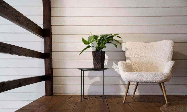
  • Plants, linen and natural light help complete an organic look.
  • Light, mid and dark tones each create a different mood in a room.

Bringing the Outdoors In, One Surface at a Time

There’s something about wood that just works at home. Its grain, colour and texture add a sense of calm that’s hard to get from flat, uniform surfaces. If you like that look but want something easier to maintain than solid timber, it’s worth taking a closer look at textured wood laminate. Unlike smooth prints, a laminate with texture lets you feel the grain as well as see it, which makes the effect far more convincing. Here’s how wood grain finishes can bring a bit of the outdoors into your space.

Why Wood Grain Works So Well Indoors

Wood brings variety without feeling busy. The lines, knots and slight colour shifts in natural grain break up a room’s hard edges and add a softer, more relaxed character. It’s the kind of detail you notice up close, but it doesn’t compete with everything else in the space.

Getting that same character from textured wood laminate is easier than you might think. On some designs, the surface texture follows the printed grain, so ridges and knots sit right where you’d expect them on real timber. You get that natural feel under your fingertips, along with a consistent finish that doesn’t need oiling or sealing the way solid wood does.

Places Where Texture Really Shows

Grain looks its best where light hits it at an angle or where people actually touch it. Choosing a laminate with texture for these spots makes the most of that tactile quality:

  • Living room wall panelling, where light from windows or wall lamps picks up the ridges in the grain throughout the day.
  • Built-in window seats and benches, since people sit on them and run their hands across them, so the texture gets noticed.
  • Study desks and open shelving, which can bring a little warmth into a workspace that might otherwise feel quite functional.

Out-of-sight areas like cabinet interiors are fine with smoother finishes.

Pairing Wood With Other Natural Touches

Wood sits comfortably alongside other materials that feel organic. Indoor plants add colour and life, while linen curtains, cotton throws and woven baskets bring softness. Stone-look countertops or terrazzo-style tiles can go nicely next to wood grain too, adding a cooler contrast without feeling out of place. A jute rug or a rattan chair also keeps the palette earthy and relaxed.

Natural light ties it all together. Keeping window treatments light and airy lets daylight move across a laminate with texture, showing off the depth of the grain. In the evening, warm white bulbs help wood tones stay cosy instead of looking flat or washed out.

Choosing a Wood Tone for the Mood You Want

The tone you pick shapes how the whole room feels.

Tone The Feel It Creates Where It Works Nicely
Light An airy look with soft, pale grain, similar to oak or ash. Smaller rooms or spaces with limited natural light.
Mid A balanced warmth that suits most colour schemes. Living and dining areas where people gather often.
Dark A richer, more enclosed mood with deeper contrast in the grain. Studies, bedrooms or a single accent wall.

Tones shift depending on their surroundings, so check your chosen textured wood laminate against your flooring and furniture.

Letting Nature Set the Tone

Wood grain is one of the simplest ways to make a home feel more grounded. Texture that follows the grain makes laminate look and feel closer to real timber, and placing it where light falls and hands reach lets that detail show. Pair it with plants, soft fabrics and daylight, and the space feels more connected to the outdoors.

Choosing the right tone matters just as much as the texture. Lighter wood keeps compact rooms feeling open, mid tones bring everyday warmth, and darker finishes create a cosier corner. Whether you’re panelling a wall or refreshing a desk, small wood grain touches can change how a room feels.

Contact Jennings to explore its wood grain finishes and find the texture and tone that suit your home.
Choosing an interior style involves far more than merely selecting furniture, fixtures and colour palettes. The underlying design philosophy can fundamentally influence how a room feels, how much visual detail it contains, how light interacts with surfaces and how materials are used throughout the space. Minimalist interior design and Wabi-Sabi interior design can appear remarkably similar at first glance because each style tends to favour quiet restraint, natural materials, clean arrangements and uncluttered living spaces.

The crucial difference becomes much clearer when you examine the core reasoning and historical context behind each approach. Minimalism tends to place a strong emphasis on simplicity, geometric clarity, function and systematically reducing unnecessary elements to create order. Wabi-Sabi embraces simplicity as well, but it gives far greater appreciation to organic variation, the natural process of ageing, subtle textures and delicate imperfection in everyday objects.

1. Approach To Simplicity

Minimalist interior design generally aims to reduce visual elements strictly to what is necessary, practical or deeply meaningful. Furniture, integrated storage and decorative accents are carefully selected and arranged to build a clean, highly organised and harmonised environment free from visual clutter.

Wabi-Sabi interior design can also adopt a quiet and restrained approach, but simplicity here does not mean strict symmetry or visual uniformity. A handcrafted ceramic piece with an asymmetrical rim or irregular glazing, for example, can become a central, meaningful feature precisely because it does not look mass-produced or perfectly manufactured.

The distinction is nuanced yet profound. Minimalism constantly asks whether an item is essential to the room, whereas Wabi-Sabi reflects on what specific character, presence and narrative the item brings through its natural qualities and humble origin.

2. Use Of Materials

Material selection plays a pivotal role in establishing the mood of each style. Minimalist homes frequently feature refined timber, smooth stone, pristine glass, brushed metal and engineered materials chosen specifically for their sleek appearance, durability and sleek practical performance.

Conversely, Wabi-Sabi design places a much stronger emphasis on materials in their raw, untreated or deeply tactile state. Visible wood grains, rough lime-wash wall finishes, weathered linen and authentic signs of natural wear contribute directly to the overarching aesthetic.

This ethos guides decisions across flooring, wall finishes, bespoke joinery and decorative accessories. Rather than attempting to conceal every small variation, a Wabi-Sabi approach allows authentic material characteristics and organic textures to remain visible, celebrating how materials evolve gracefully over time.

3. Attitude Towards Imperfection

One of the most distinct contrasts between the two styles involves their attitude towards imperfection. Minimalist design generally strives for pristine visual order, crisp lines and smooth alignment, meaning finishes, joinery and furniture items are selected for their consistency, precision and flawless detail.

Wabi-Sabi interior design, on the other hand, warmly accepts irregularity and patinas as vital aspects of an object’s history and soul. A slightly uneven plaster finish, soft hairline cracks in earthenware, or naturally varied timber knots do not require restoration or cover-ups.

Importantly, this perspective does not imply that a Wabi-Sabi home should feel chaotic or untidy. The room remains thoughtfully arranged and well-balanced, while allowing chosen natural imperfections to add emotional depth, tactile warmth and unique personality.

4. Decoration And Objects

Minimalist interiors intentionally limit accessories and decorative accents to preserve a strong sense of open space. Every single object must justify its inclusion by contributing functionally or aesthetically without causing visual clutter or distraction.

Wabi-Sabi spaces also avoid excessive ornamentation, yet individual items often carry deeper emotional value, craftsmanship or history. A hand-thrown clay bowl, an aged solid timber bench, or vintage hand-woven fabrics hold a place in the home due to their unique story, authentic origin and sensory texture.

For homeowners, this involves curating spaces thoughtfully-selecting individual pieces based on personal meaning, artistic resonance and enduring quality rather than following transient retail trends or decorative fads.

5. Colour And Atmosphere

Minimalist homes typically utilise neutral colour schemes to cultivate a calm, expansive and cohesive atmosphere. Crisp whites, cool greys, soft creams and muted monochrome palettes provide a consistent backdrop that highlights architectural lines and spaciousness.

Wabi-Sabi environments lean towards similarly subtle palettes, specifically earth-toned shades inspired by nature such as warm terracottas, muted moss greens, warm taupes and stone greys. However, the design focus rests on warmth, rich texture and atmospheric depth rather than strict colour uniformity or high contrast.

Style Comparison

Area Minimalist Approach Wabi-Sabi Approach
Simplicity Removes excess to streamline spaces Values restraint
Materials Clean and functional Natural and tactile
Imperfections Usually minimised for crisp precision Can be embraced
Objects Few, purposeful pieces Meaningful, characterful pieces
Colour Controlled neutrals Earthy, muted tones

Both design philosophies offer peaceful alternatives to overly cluttered modern living spaces. Whether you prefer the structured clarity of minimalism or the rustic, organic warmth of Wabi-Sabi, aligning your home with a clear aesthetic direction creates a more harmonious environment.

Contact Hoft Interior to discuss how minimalist or Wabi-Sabi principles can be tailored to suit your home’s layout, material preferences and desired atmosphere.

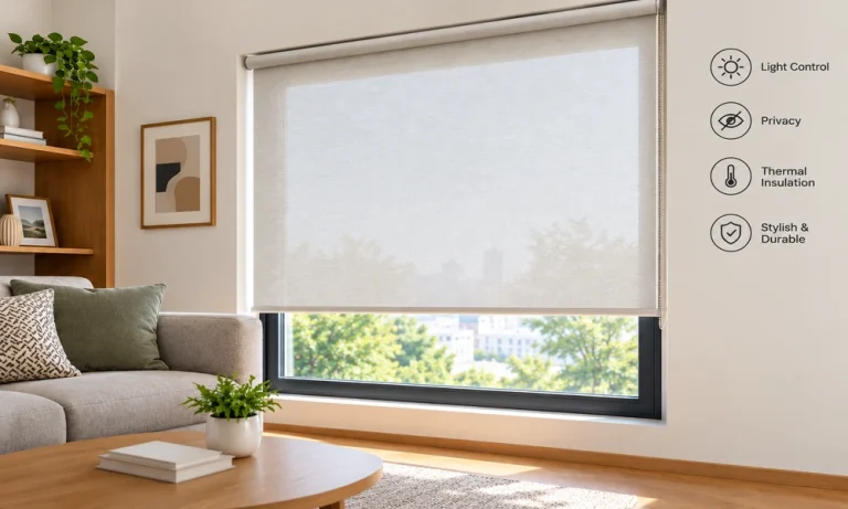
Windows have a big influence on how a room looks and feels. The right window covering can control sunlight, add privacy, and make the space feel more finished. Roller blinds for windows are a practical choice for both homes and offices because they combine a clean appearance with everyday functionality.

Available in different fabrics, colours, and light-control options, they can work with everything from a cosy bedroom to a modern workspace.

Why Choose Roller Blinds for Windows?

Roller blinds have a straightforward design that makes them easy to use and suitable for different types of interiors. Unlike bulky curtains, they roll neatly when opened and take up very little visual space.

They can also be customised to suit the size and style of a window. Whether you have a small bedroom window, a wide living-room opening, or several office windows, roller blinds can create a consistent look throughout the space.

A Clean and Modern Look

One of the biggest attractions of roller blinds is their minimal appearance. The simple fabric panel fits close to the window and avoids adding unnecessary layers to the room.

This makes them particularly useful for modern interiors where a neat, uncluttered appearance is preferred.

Roller Blinds for Homes

Every room at home can have different lighting and privacy needs. A bedroom may need better light control, while a living room may benefit from softer daylight.

Living Room

For living rooms, consider fabrics that filter harsh sunlight without making the room completely dark. Neutral shades such as beige, cream, grey, or white can blend easily with most furniture and wall colours.

If your living room receives strong afternoon sunlight, a suitable sunlight control blind can make the space more comfortable while also helping protect furniture and flooring from excessive direct sunlight.

Bedroom

Bedrooms usually need more privacy and better control over early morning or outdoor light. Blackout roller blinds can be a practical choice when you want the room to stay darker during sleeping hours.

Pairing a blackout fabric with a calm colour can also create a relaxed atmosphere without making the window look too heavy.

Kitchen and Dining Areas

For kitchens and dining spaces, choose blinds that are practical and easy to maintain. Simple designs in neutral or subtle colours can complement the room without competing with cabinets, countertops, or dining furniture.

Roller Blinds for Offices

Office windows have different requirements. Employees need comfortable lighting for screens and work, while meeting rooms may need privacy during presentations or discussions.

Office roller blinds can help create a more controlled working environment by reducing glare and managing incoming daylight.

Workstations

Direct sunlight can create glare on computer screens, making it harder to work comfortably. Light-filtering roller blinds can soften strong daylight while still allowing natural light into the workspace.

The right fabric can help create a more balanced environment without making the office feel dark.

Meeting Rooms

Privacy becomes especially important in meeting rooms, conference rooms, and executive offices. Roller blinds can be adjusted when privacy is required and opened when natural light is preferred.

For rooms used for presentations, a darker or blackout option may also be useful when screens and projectors are being used.

Types of Roller Blinds to Consider

Not all roller blinds offer the same level of light control or privacy. Understanding the main options can help you select something that suits your room.

Blackout Roller Blinds

Blackout blinds are designed to block most incoming light when closed. They can be particularly useful for bedrooms, media rooms, and offices where glare needs to be reduced.

Sunscreen Roller Blinds

Sunscreen fabrics allow some natural light into the room while helping reduce harsh glare. They are a popular option for spaces that need daylight without excessive brightness.

Light-Filtering Roller Blinds

Light-filtering blinds provide a middle ground between privacy and natural light. They soften incoming sunlight rather than completely blocking it, making them suitable for living rooms and general office areas.

How to Choose the Right Roller Blinds

Choosing window blinds is not only about colour. Think about how the room is used and what you want the blinds to achieve.

Consider Light and Privacy

Start by looking at how much sunlight enters the room throughout the day. A bedroom facing the morning sun may need different blinds from a north-facing office with softer daylight.

Privacy is another important factor. If your windows face a road, neighbouring building, or busy area, consider a fabric that provides sufficient privacy when closed.

Match Your Interior Style

The blinds should complement the rest of the room. Neutral shades are versatile, while darker or contrasting colours can create a stronger design feature.

If you are working with an existing colour palette, choose a blind that connects naturally with your walls, furniture, flooring, or other soft furnishings.

Think About Maintenance

Windows in kitchens and high-traffic office areas may collect dust more quickly. Select a fabric and finish that can be maintained easily with regular cleaning.

For a coordinated interior, brands such as Lusso Decor can offer different window-covering styles suited to residential and commercial spaces.

Roller Blinds vs Curtains

Curtains remain a popular choice, but roller blinds offer a different aesthetic and practical experience. Curtains can add softness and texture, while roller blinds provide a streamlined appearance.

Roller blinds can also be useful when floor space around the window is limited. They sit close to the window and can work particularly well in compact rooms or contemporary offices.

The choice ultimately depends on the room, your preferred style, and the level of light and privacy control you need.

Benefits Beyond Appearance

Good window coverings can contribute to more than just interior design. By controlling direct sunlight, blinds can make a room feel more comfortable during bright parts of the day.

They can also provide an additional layer of privacy and help create a more pleasant environment for relaxing, working, or entertaining.

For offices, reducing screen glare can make workstations more comfortable. At home, controlling daylight can help create a better environment for watching television, sleeping, or simply relaxing.

Conclusion

Roller blinds are a versatile window-covering option for both residential and commercial interiors.

From bedrooms and living rooms to workstations and meeting rooms, the right style can improve privacy, manage daylight, and give windows a neat, finished appearance.

When choosing roller blinds for windows, consider the room’s lighting, privacy requirements, interior style, and maintenance needs.

Whether you prefer blackout, sunscreen, or light-filtering fabrics, selecting the right option can make your windows both practical and visually appealing.

The dog who takes your seat might make a convincing fictional monarch. The cat who surveys the room from a shelf might suit a formal character portrait. A playful role gives a custom pet portrait a different kind of appeal from a straightforward photograph, especially when the joke is familiar to the person who will receive it.

The challenge is keeping the pet recognizable while the surrounding character is imagined. More clothing, props, and background detail do not automatically make the picture more personal. Start with a real expression and a specific shared joke, then choose a treatment that supports them.

Choose the joke before choosing the costume

Think about the ordinary moment that makes you smile. It may be the dog guarding an empty armchair or the cat looking unimpressed when dinner is late. You do not need a grand story about the animal’s personality; one recognizable family observation can guide the idea.

Describe the intended tone in plain language. A quietly formal portrait makes a different joke from an energetic theatrical scene. If you are giving the artwork to another person, consider which version they would enjoy living with after the initial reveal.

Keep the idea affectionate rather than embarrassing. A private nickname may be funny in conversation but awkward on an object displayed at work. Do not assume the recipient wants every household joke made permanent in their decor.

The role is a fictional artistic choice. It does not establish anything about the pet’s temperament, status, or history. Let the concept be playful without using it to make unsupported claims about what the animal thinks.

Let the real face carry the character

A familiar expression often supplies enough personality on its own. Before selecting decorative clothing, find a reference with clear eyes, visible ears, and a muzzle shape that feels like your pet. Check the original file rather than relying on a tiny thumbnail.

Ask what should remain faithful to the photograph. You might want the slight head tilt, the darker eyebrow marking, or the relaxed closed mouth preserved. Naming those details helps keep the face from becoming a generic animal attached to an elaborate outfit.

Do not request a smile merely because the scene is humorous. A serious expression may be the entire joke. Likewise, a shy-looking or resting face can work in a fictional role if it is the expression the family recognizes.

For custom dog portraits, separate the animal’s identifying features from the imaginative setting in your brief. The coat pattern belongs to the likeness; a fictional jacket belongs to the artistic treatment. Keeping those instructions distinct makes your priorities easier to understand.

Add the fictional role through the artwork

You do not need to dress the real animal in a costume to explore a character portrait. Begin with a suitable ordinary photograph and choose a design whose imagined clothing or setting provides the role. Confirm that the provider offers the treatment you want.

This keeps the reference focused on the face instead of on an outfit that may hide ears or change the silhouette. It also avoids staging an unnecessary session simply because the finished artwork will be fictional.

If you already have a costume photograph, evaluate it like any other reference. Are the features clear? Does it show the expression you want? The fact that the clothing matches the theme does not make a poor facial reference more useful.

Custom portrait ideas from Pawfolio Art can help you explore how a pet face might be presented. Read the exact product options and examples before assuming a design can accommodate a requested character, prop, or pose. A selected style is not a promise of unrestricted custom illustration.

Keep the surrounding details in proportion

Look at what your eye notices first. If the clothing dominates and the face feels secondary, decide whether that is really the portrait you intended. You can enjoy theatrical detail while still asking for the pet to remain the main subject.

Consider the background as part of the tone. A restrained setting may let a formal role feel quietly funny. A more detailed scene may suit someone who enjoys decorative artwork. Neither is inherently more authentic; the relevant test is whether it fits your particular recipient.

Avoid collecting every possible symbol into one image. A crown, several props, a long title, and a busy setting may compete with the expression. Choose the details the available design supports and let an accompanying card explain the larger joke.

If a royal-style presentation is what you have in mind, Pawfolio Art’s royal Canvas options provide a format-specific next step. Keep Canvas distinct from an Art Print when selecting a physical product. The fictional role and the product’s construction are separate choices.

Check the recipient’s taste as carefully as the likeness

A humorous portrait is still an object someone may keep for years. Think about whether the recipient enjoys playful art, prefers a quieter room, or would rather choose the final design themselves. Knowing that they love their pet does not settle those questions.

You can preserve the surprise while checking a broad preference. Ask whether they would like a realistic presentation or a fictional role, or show a small selection of unrelated examples. If their preference remains unclear, invite them into the process rather than forcing a finished concept.

Be especially cautious with text. A pet name may be welcome where the selected product allows it, while an invented title may not be. Confirm spelling and any included wording; do not treat a humorous inscription as harmless just because it amuses the giver.

The artwork should also fit the recipient’s available space. Choose the intended location and size separately from the comic idea. A large portrait is not automatically a stronger joke or a better gift.

Review whether the finished image still feels personal

When reviewing a proof, hide the decorative details mentally and examine the face. Would you recognize the pet from the features and expression? If the answer is uncertain, address the likeness before asking for more background decoration.

Then consider the complete image. Does the role connect with the ordinary moment you began with? A coherent fictional character can be more effective than a collection of unrelated references, even when the simpler version looks less elaborate.

Write revision notes around specific priorities. You might ask to preserve the ear shape, keep the mouth as shown in the reference, or reduce a distracting element if the design permits that adjustment. Avoid changing the concept completely through scattered messages.

Pet portraits can be affectionate and funny without losing the animal inside the idea. Choose a recognizable expression, give the imagined role a clear purpose, and keep the recipient’s taste in view. The best test is whether the family recognizes both the pet and the reason for the joke.

[Image Suggestion: A modern Singapore HDB living room bathed in soft, diffused afternoon light streaming through elegant sheer drapes.]

When designing a home in Singapore, the atmosphere of a room is often decided by how effectively you manage natural light and architectural boundaries. Housing & Development Board (HDB) flats, known for their functional layouts and distinct window configurations, present a unique canvas for interior styling. Far from being simple utilitarian covers, thoughtfully chosen HDB curtains serve as decorative anchors that soften harsh geometric lines, introduce tactile warmth, and frame outdoor views with undeniable elegance.

Creating an inviting interior mood relies on balancing light, privacy, and aesthetic harmony. By treating window drapes as an integral design layer rather than an afterthought, homeowners can effortlessly elevate their living spaces from standard functional units into personal sanctuaries of style and comfort.

The Architectural Role of Window Drapes in Modern Flats

In high-density urban environments, windows are the primary connection between your personal haven and the outside world. The right drapery frames this connection, establishing visual height and fluid movement within a room. Hanging drapes close to the ceiling line and letting them fall gracefully to the floor creates a striking vertical illusion, making standard living areas feel expansive and airy.

Furthermore, selecting the appropriate fabric weight shapes how light behaves throughout the day. Incorporating day curtains in Singapore allows homeowners to make the most of tropical sunshine without suffering from intense glare or heat build-up. These lightweight fabrics act as ambient filters, softening incoming daylight while maintaining a comfortable degree of daytime privacy.

Layering Fabrics for Light, Privacy, and Depth

Achieving a nuanced interior style often comes down to layering. A single window treatment rarely fulfils all functional and aesthetic demands across different hours of the day. Combining translucent sheer fabrics with heavier blackout drapes offers maximum versatility for tropical living.

During the bright morning and afternoon hours, drawing lightweight sheer drapes diffuses harsh rays into a pleasant glow across furniture and floors. As evening approaches, layering in denser night fabrics secures total privacy and creates an intimate, cosy backdrop for relaxation. This layered approach adds physical texture to wall spaces, making interiors feel rich, considered, and tailored.

Key Design Takeaways for Homeowners

  • Maximise Visual Height: Mount curtain tracks near the ceiling to draw the eye upward and accentuate vertical dimensions.
  • Harness Natural Light: Utilise day curtains in Singapore to filter daylight evenly, reducing glare while maintaining brightness.
  • Layer for Versatility: Pair sheer and opaque fabrics to effortlessly transition between daytime light filtration and evening privacy.
  • Select Complementary Tones: Choose neutral or muted fabric palettes that harmonise with wall colours and wooden furnishings.

Comparing Fabric Types for Tropical Living

Understanding how different window fabrics perform helps ensure your choices remain both beautiful and durable over time.

Fabric Type Light Control & Function Ideal Interior Setting
Sheer Fabrics Softly diffuses direct sunlight while retaining daytime views. Living rooms and dining areas.
Dim-Out Drapes Blocks 70%-90% of incoming light for balanced shade. Study rooms and entertainment lounges.
Full Blackout Fabrics Completely eliminates light penetration for maximum privacy. Master bedrooms and nurseries.

Frequently Asked Questions

How do I choose the right length for HDB curtains? For a polished look, drapes should ideally skim the floor or sit approximately half an inch above it. Avoid floor puddle lengths in humid environments, as hovering slightly above floor level keeps hem lines clean and free from dust.

Are sheer fabrics sufficient for privacy in high-rise apartments? During the day, sheer drapes reflect outdoor light, preventing onlookers from seeing inside while allowing you to enjoy external views. However, when indoor lights are switched on at night, sheer fabrics become transparent, making a secondary opaque drape necessary.

Window treatments are a powerful tool in interior design, bridging the gap between practical functionality and aesthetic refinement. By choosing well-suited HDB curtains and complementary light-filtering sheer fabrics, you can control ambient light, enhance room proportions, and cultivate a warm, welcoming home atmosphere.

Ready to transform your home with bespoke window solutions tailored to your unique lifestyle? Discover premium soft furnishings and expert styling guidance at De Art Curtain! Contact us today to learn more.

There is a balance in using a minimalist exterior to make a home look clean and modern, but too many stark surfaces or too few details can sometimes make for a cold home. The difficulty is keeping minimalism easy to do and ensuring there is enough warmth to ensure the exterior is comfortable and welcoming. These can be obtained with a few simple design decisions.

Achieving this balance doesn’t require a complete architectural overhaul, but rather a thoughtful approach to subtle details. By focusing on intentional choices, homeowners can easily blend clean, modern aesthetics with inviting, cozy elements. Following a practical Warmth Minimalism Exterior Design Guide can help you navigate these choices, ensuring your home maintains a sleek profile without feeling overly sterile or unwelcoming.

Use a Simple Foundation to begin with.

The basic idea of the design should be simple. A minimalist appearance can be created with clean architectural lines, simple shapes and a limited number of design elements. If the basic structure is simple, the warmth could be added by careful choice of materials and detail, but not by overdecoration.

Choose Warm Materials

A contemporary exterior can be softened with materials like natural wood, stone, brick or textured finishes. Wood can be employed for the doors, screens or architectural details and stone and brick can be used for the walls and pathways to provide depth. The materials used are meant to add character to the design without taking over.

use warm neutral colours.

Bright white, black or cool grey is not the only choice for a minimalist colour scheme. Beige, cream, taupe, soft brown and muted earthy shades can help to establish a warmer environment. A few complementary colours help to keep the exterior organised.

Add Greenery Carefully

With a simple exterior, plants and landscaping can add a natural element. Homeowners may opt to plant a few strategically located trees, shrubs or planters rather than a large number. Landscaping can help to break up some of the hard lines that a building offers while still looking tidy.

Introduce Texture

Texture was used to bring some interest but not clutter. A more appealing facade can be achieved by using a combination of smooth concrete and timber, textured plasterwork, natural stone or matte finishes. Use a few contrasting textures that complement one another.

Give careful consideration to the entrance.

The entrance is an important opportunity to add warmth. The use of a natural wood door, simple outdoor lighting, a well-kept pathway, or a well-planned plant selection can help to create a more inviting atmosphere for the home. These subtle elements can make a big impact and not detract from the minimal aesthetic.

Experiment with Lighting to Create an Atmosphere.

Exterior lighting can help create a comfortable feeling in a simple design during the evening, with warm lighting. Lighting can be set up along paths, around the entrance, or to feature architectural elements. It’s generally better to go for minimalist fixtures and a soft, warm light.

Conclusion:

There is a simple balance between warmth and simplicity that must be carefully considered. Using clean lines and natural elements, soft hues, light tactile finishes, plants can all work together to make a home exterior modern and comfortable.

Key Takeaways

  • Minimalist lighting keeps rooms calm and flexible while fitting daily routines without visual clutter.
  • Simple fixtures suit changing layouts and furniture choices across shared and private spaces.
  • Clean designs make upkeep easier and reduce long-term maintenance concerns.
  • Thoughtful placement helps light stay even and practical throughout the day.

Introduction

Living spaces today ask for calm visuals, easy upkeep, and lighting choices that feel settled instead of loud. Clean shapes and soft output fit daily routines without visual clutter, which explains why many homeowners gravitate towards ceiling lights. Minimalist lighting keeps rooms usable, flexible, and friendly to changing layouts, while letting furniture and finishes hold attention without fighting for it.

Why Minimalist Lighting Fits Daily Living

Keeping Spaces Calm Without Feeling Bare

Designing a home usually starts with how rooms feel during everyday use, so lighting choices play a steady role from morning to night. Light spreads evenly across floors and work areas when ceiling downlights sit in the right positions, creating a sense of order without demanding attention. Minimal fixtures sit quietly above, leaving walls open for art, shelving, or plain breathing space.

Choosing simple lighting shapes avoids visual noise, which helps rooms feel settled even during busy days. Neutral finishes blend well with timber, stone, or painted surfaces, offering flexibility during future furniture changes. Light becomes a background player, not the headline act, which suits households juggling work, rest, and family life.

Practical Benefits That Make Sense Over Time

Lighting choices often stay in place for years, so practicality matters from the start. Cleaning stays quick when uncomplicated designs are chosen, since smooth surfaces on ceiling lights collect less dust and avoid fiddly parts. Maintenance stays manageable, especially in shared spaces where upkeep needs to stay simple.

Energy use also stays predictable when fittings pair well with modern bulbs. Soft brightness levels help reduce glare while keeping rooms usable for reading, cooking, or unwinding. Minimalist designs focus on function first, allowing homes to feel consistent across seasons without frequent updates or adjustments.

Flexible Placement for Changing Needs

Room layouts change as families grow or habits shift, so lighting flexibility holds value. Rooms gain adaptable coverage when thoughtful positions are used, allowing furniture to move without leaving dark corners thanks to ceiling downlights. Kitchens, hallways, and living areas benefit from evenly spaced light that follows movement instead of focusing on fixed spots.

Such placement can affect different activities throughout the day. Morning routines, evening meals, and relaxed nights all work under steady lighting without constant switching. Minimalist fittings adapt quietly, offering balance across open-plan spaces and smaller rooms alike.

Where Minimalist Ceiling Lighting Works Best

Living Areas That Stay Comfortable

Living rooms often serve multiple roles, so lighting choices need to keep pace. Visual clutter stays out of the picture while enough brightness remains for gatherings or quiet evenings when simple forms define ceiling lights. Neutral tones suit sofas, rugs, and shelves without stealing attention from personal touches.

Layering light through dimmable options adds flexibility without adding fixtures. Soft control keeps atmospheres relaxed without fuss, supporting everyday comfort without constant adjustments or technical complexity.

Kitchens and Dining Spaces

Food preparation and shared meals call for reliable lighting that feels steady. Visibility stays consistent above work surfaces without harsh shadows when ceiling downlights handle the task. Clean designs suit modern cabinetry while keeping focus on practical use.

Even lighting helps people move safely during busy cooking periods. Simple fittings also avoid grease traps or awkward cleaning tasks, keeping kitchens functional and visually calm across daily use.

Bedrooms and Private Corners

Restful spaces benefit from lighting that stays subtle and predictable. Bedrooms feel settled during both early mornings and late nights when gentle output comes from ceiling lights. Simple fixtures reduce visual distractions, creating a relaxed setting suited to winding down.

Pairing overhead lighting with bedside lamps creates choice without clutter. Minimalist designs keep daily routines calm without overwhelming personal comfort.

Choosing the Right Minimalist Option

Size, Colour, and Finish

Lighting should suit room proportions without overpowering ceilings or shrinking spaces visually. Compact fixtures work well in modest rooms, while slightly wider options suit open areas without drawing attention. Neutral colours like white, black, or brushed metal blend easily with varied décor.

Selecting finishes that age well helps homes stay consistent over time. Simple materials handle wear gracefully, keeping lighting practical without frequent replacements.

Installation and Long-Term Use

Professional installation ensures safety and consistent output across rooms. Effectiveness holds steady for years when wiring and spacing follow proper planning, allowing ceiling downlights to perform reliably. Long-term use becomes simpler when fittings suit everyday habits without special care needs.

Thoughtful choices reduce the need for constant upgrades. Lighting remains steady, adaptable, and easy to live with, which suits busy households balancing comfort and function.

Conclusion

Minimalist lighting suits modern homes by keeping spaces calm, adaptable, and easy to manage. Clean designs allow rooms to evolve without frequent changes, supporting daily routines across living, cooking, and rest. Choosing fixtures that focus on function and quiet presence helps homes feel settled without fuss or visual strain.

For tailored advice on selecting minimalist lighting that fits daily living, contact Sense N Bedeck today and explore options suited to modern homes.