
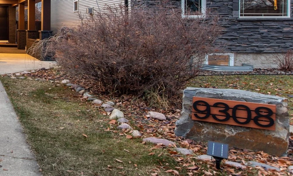
People tend to focus on paint colours, landscaping, doors, or lighting when considering exterior design. There’s little place for typography. However, the letters and numbers that surround a house can subtly influence a house’s personality. A well-selected house number, name plaque or address sign can provide a polished, welcoming, playful or modern entrance.
Thoughtful exterior typography can also help connect smaller details across a home’s facade. House numbers, address plaques, entry signs, and decorative lettering can work together to create a consistent visual style without requiring major renovations. By considering the home’s architecture, available space, materials, and visibility, homeowners can choose lettering that feels intentional while adding personality to the entrance.
The small details make for strong first impressions.
The front door is the first impression that people have of your home. That mood can be achieved almost instantaneously with typography. Envision a clean, basic number displayed next to a sleek black door. It’s modern and self-assured. Next, imagine handwritten lettering on an aged wooden plaque set amidst greenery. The atmosphere shifts dramatically, becoming warmer, relaxed, maybe a bit rustic. These details can take up just a part of the façade, but create a huge visual impact.
Evoking the Home’s Architectural Character
The best typography doesn’t compete with the architecture. Rather, it seems like it is meant to be there. A mid-century home may be a space that calls for clean, geometric lettering, bold lines and lots of breathing room. Serif fonts are great for traditional houses, and so are classic handwritten lettering for a cottage-style exterior. If you’re building a home with an industrial theme, you can use big numbers or lettering to create a dramatic touch. The idea is not just to pick a font you like, but to pick a font that communicates a visual language that is identical to the others.
Playing With Materials and Finishes
The introduction of material into typography adds to the interest. Brushed metal reflects the light in a different way than matte black letters. Wood has a warm tone, acrylic has a clean, almost floating effect against a wall. Colour is equally important. When using lettering, it’s best to use high contrast for lettering that will stand out from the street, and subtle tones for a quieter, more understated appearance.
What it takes to find the right balance.
Sometimes, the more decorative the item, the less attractive it will be. A decorative font can be a beautiful font on screen, but it can be hard to read when it’s displayed in outdoor environments. Similarly, large letters can overwhelm a small doorway. Take into account the distance from which you will be viewing, texture around the object, space available and proportions. Good typography should draw attention, but not demand it.
Let your entrance tell your story!
For homeowners wanting to show personality but without making profound changes to their home, typography is an option. Occasionally, an entrance is complete with just a few well-placed characters. From sleek and contemporary numbers to classic lettering or anything with a custom handmade touch, the right typography can elevate a mundane exterior element to a memorable design feature.

Comments are closed.